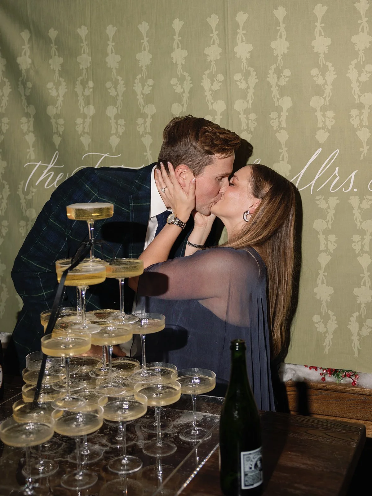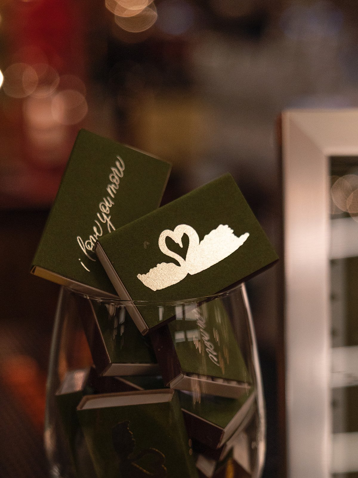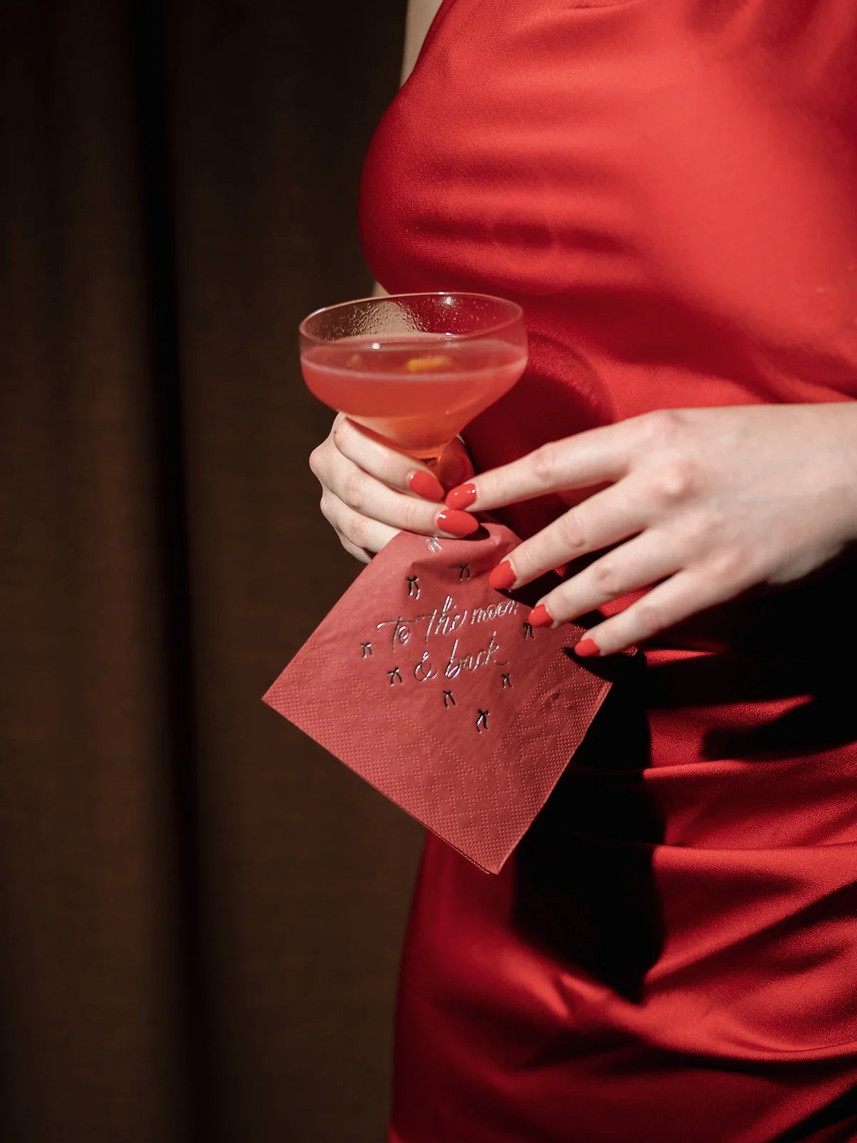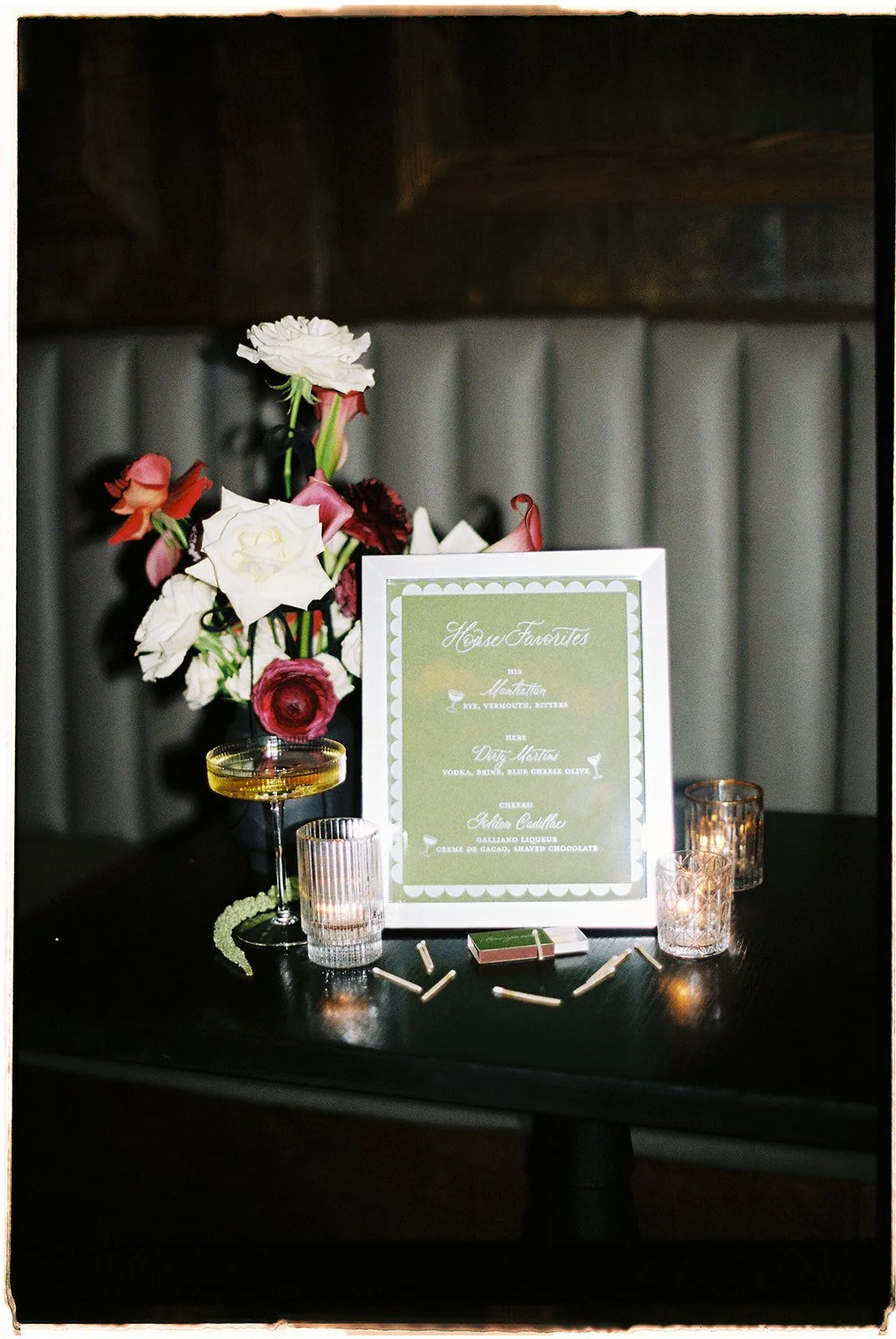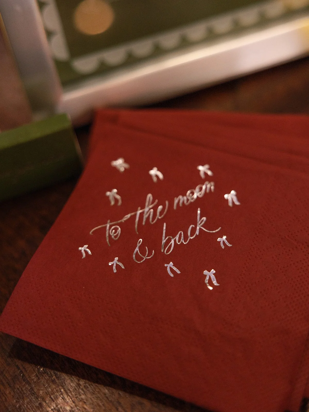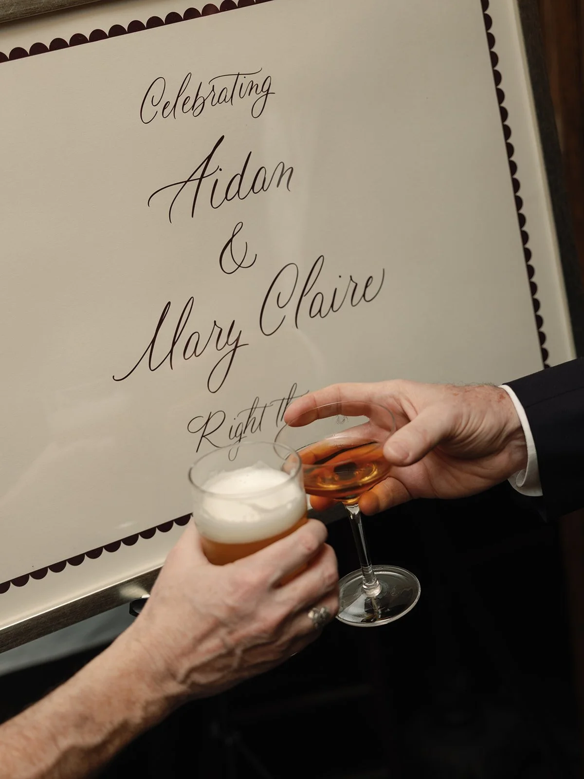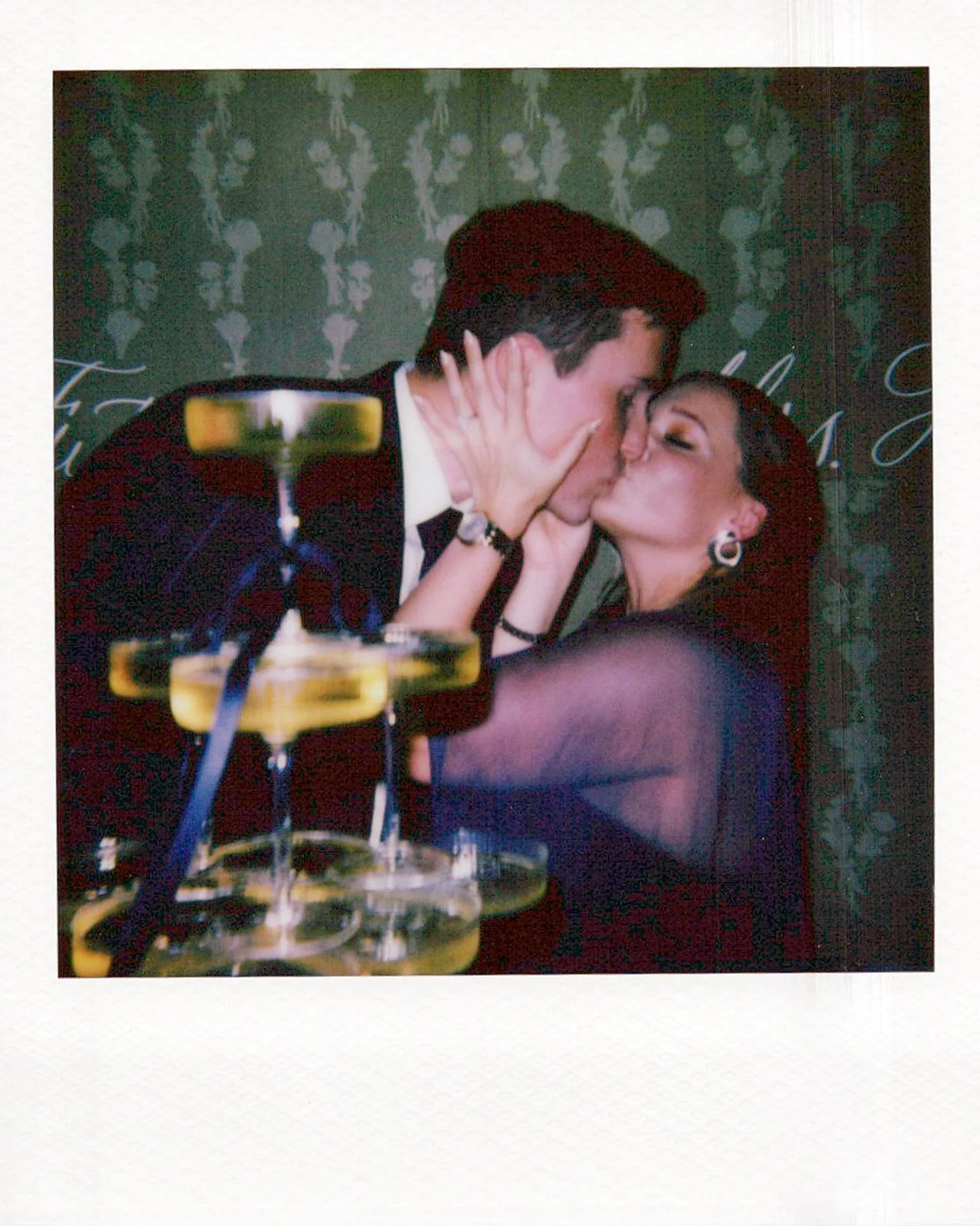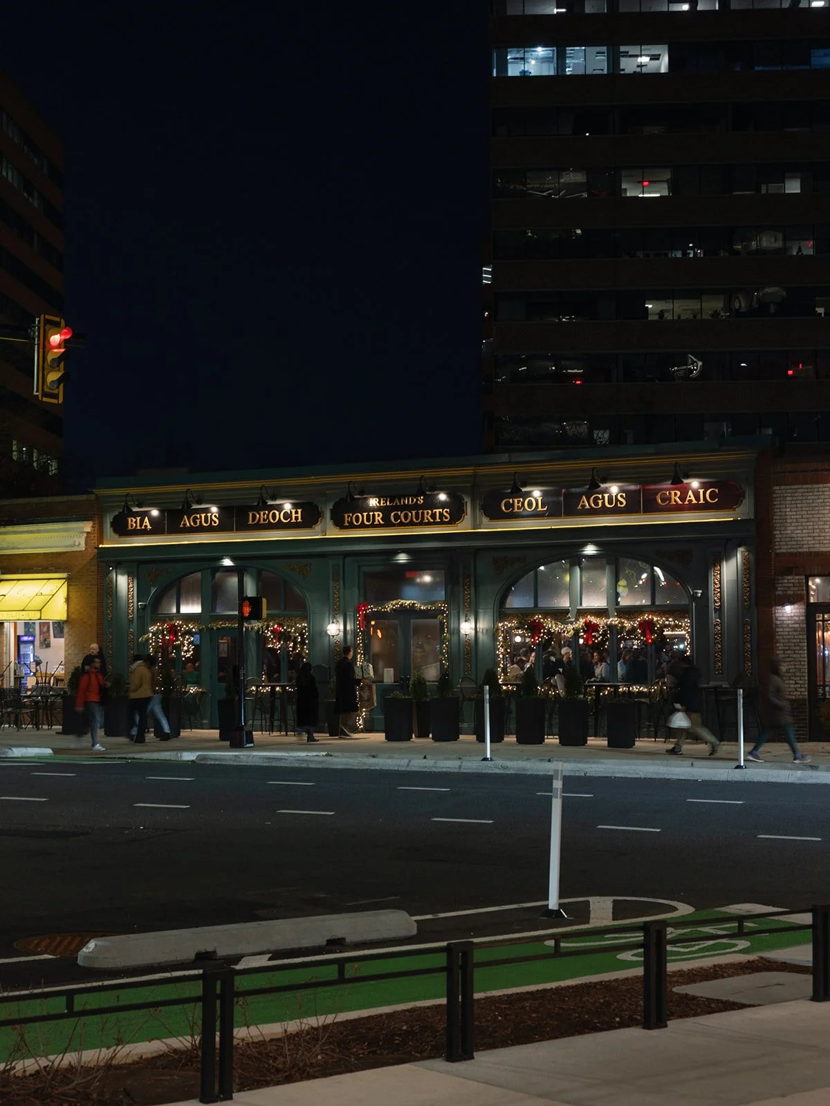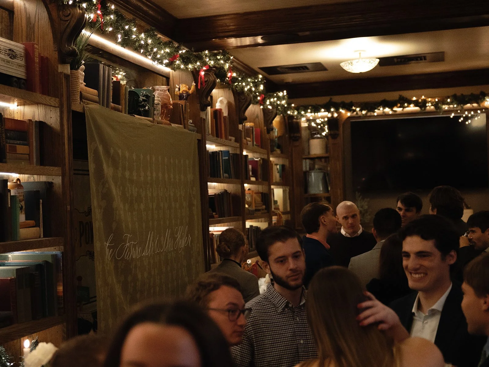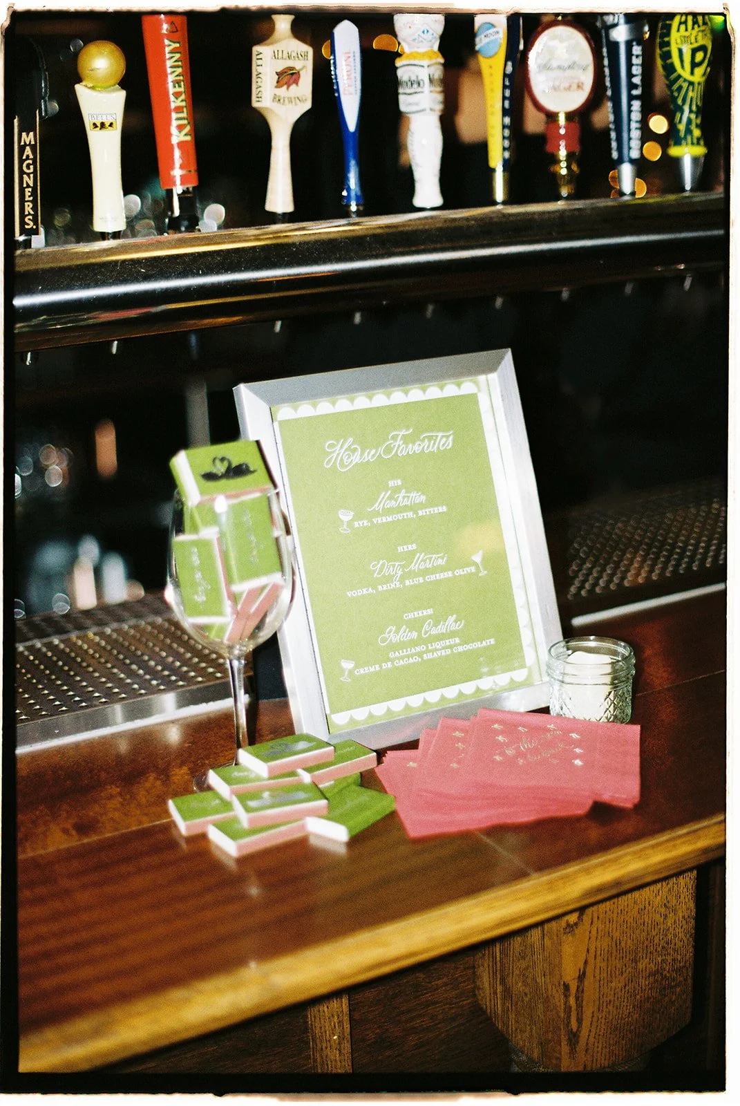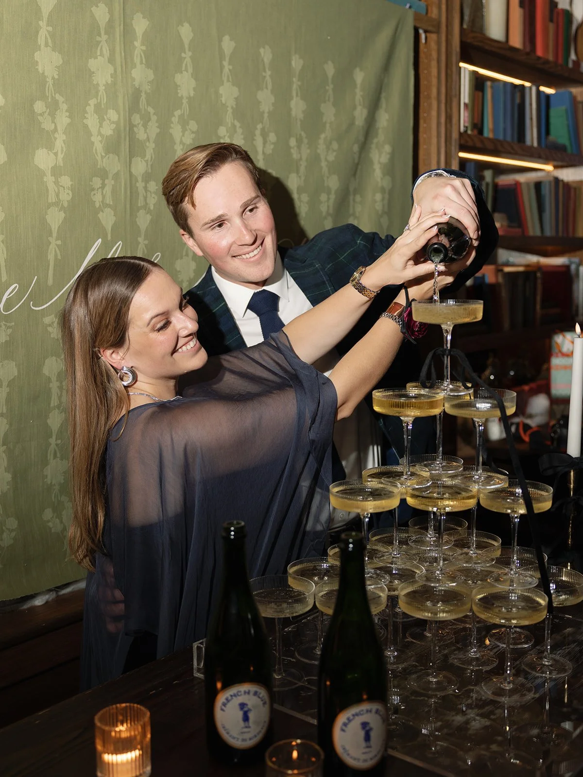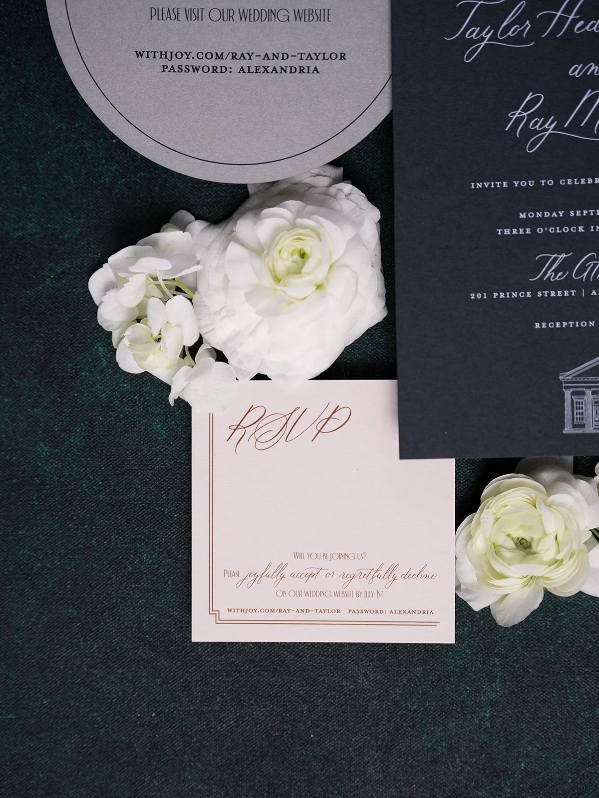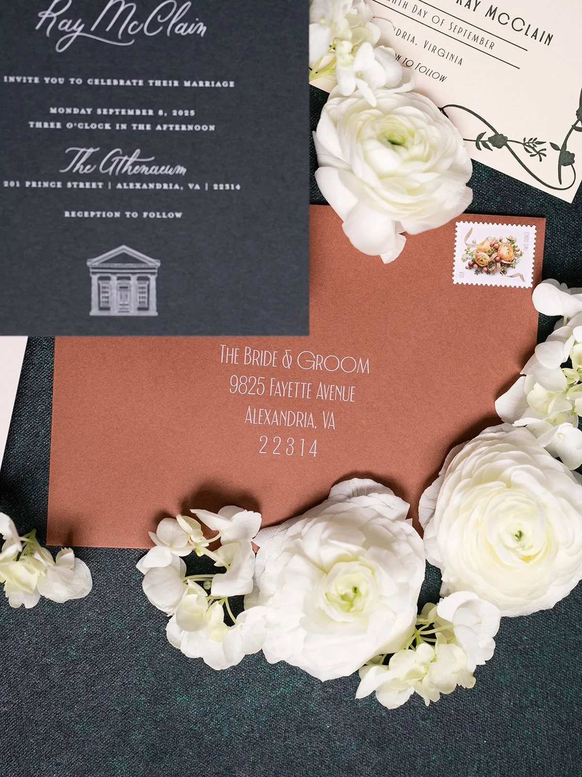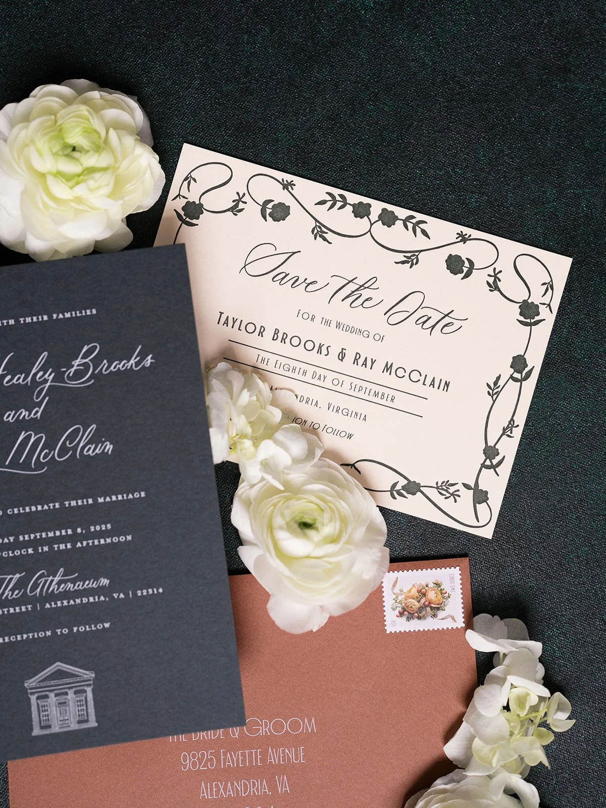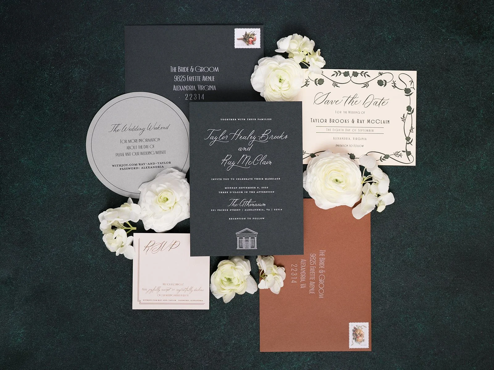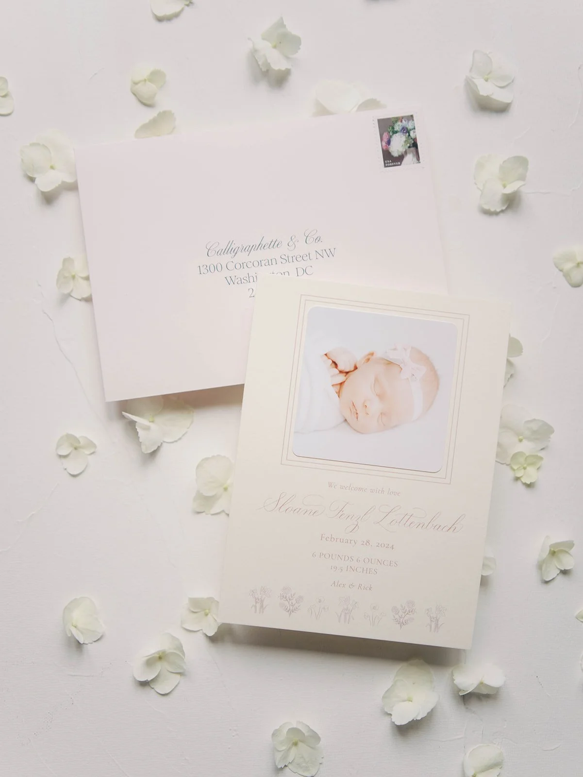

When Maya from Honey & Lavender Events reached out to me about an engagement party at Ireland’s Four Courts at the end of December, I was immediately hooked. The couple was looking for a large backdrop for their champagne tower, custom matchbooks and cocktail napkins, as well as bar signs and a small welcome sign.
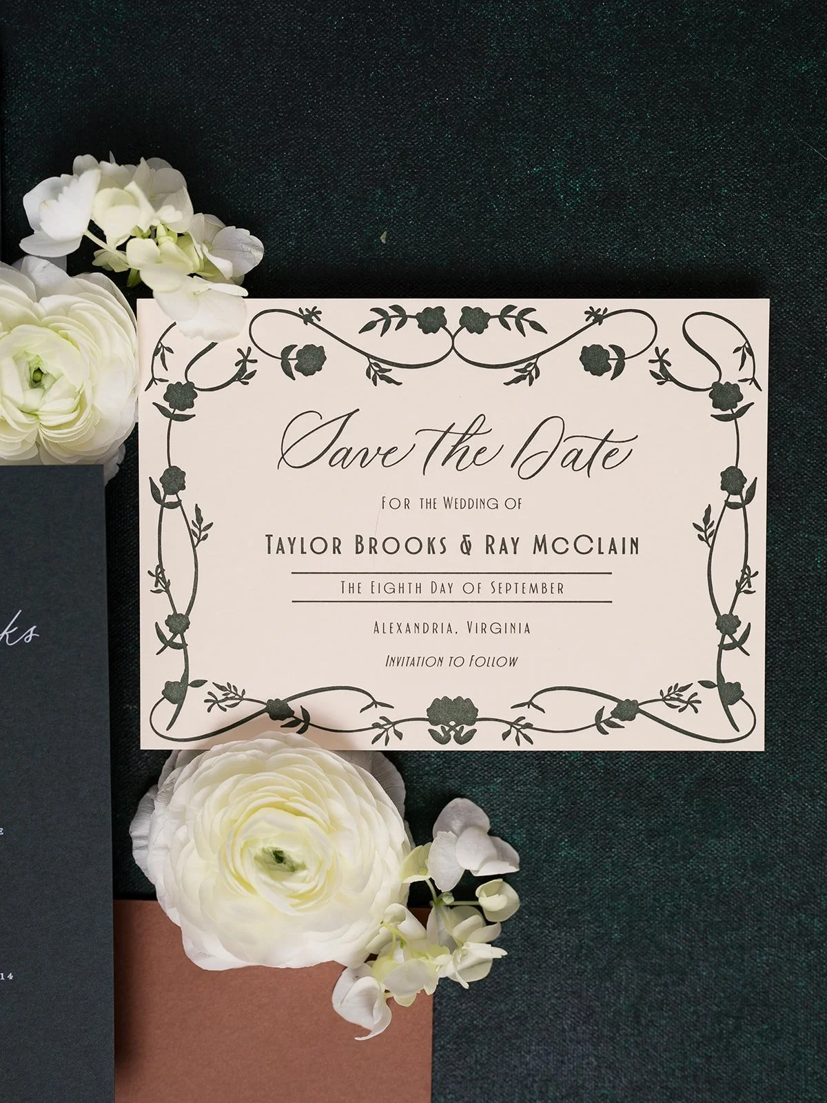
The bride-to-be sent along some imagery she liked, including bows, swans, and some particular flowers as well as a few phrases that spoke to her relationship. I had a lot of fun playing with different options, and trying to find the right balance of whimsical illustrations and an elegant simplicity I noticed from her inspiration images. We worked on the designs for a couple of weeks, moving seamlessly through edits and decisions until everything was perfected and ready to be sent off to the various printers.
Venue: @irelandsfourcourts
Florals: @stemandthistleva
Stationery and Signage: @calligraphetteco
Champagne Tower: @tippintins
Photography: @alexmccormick.photo