

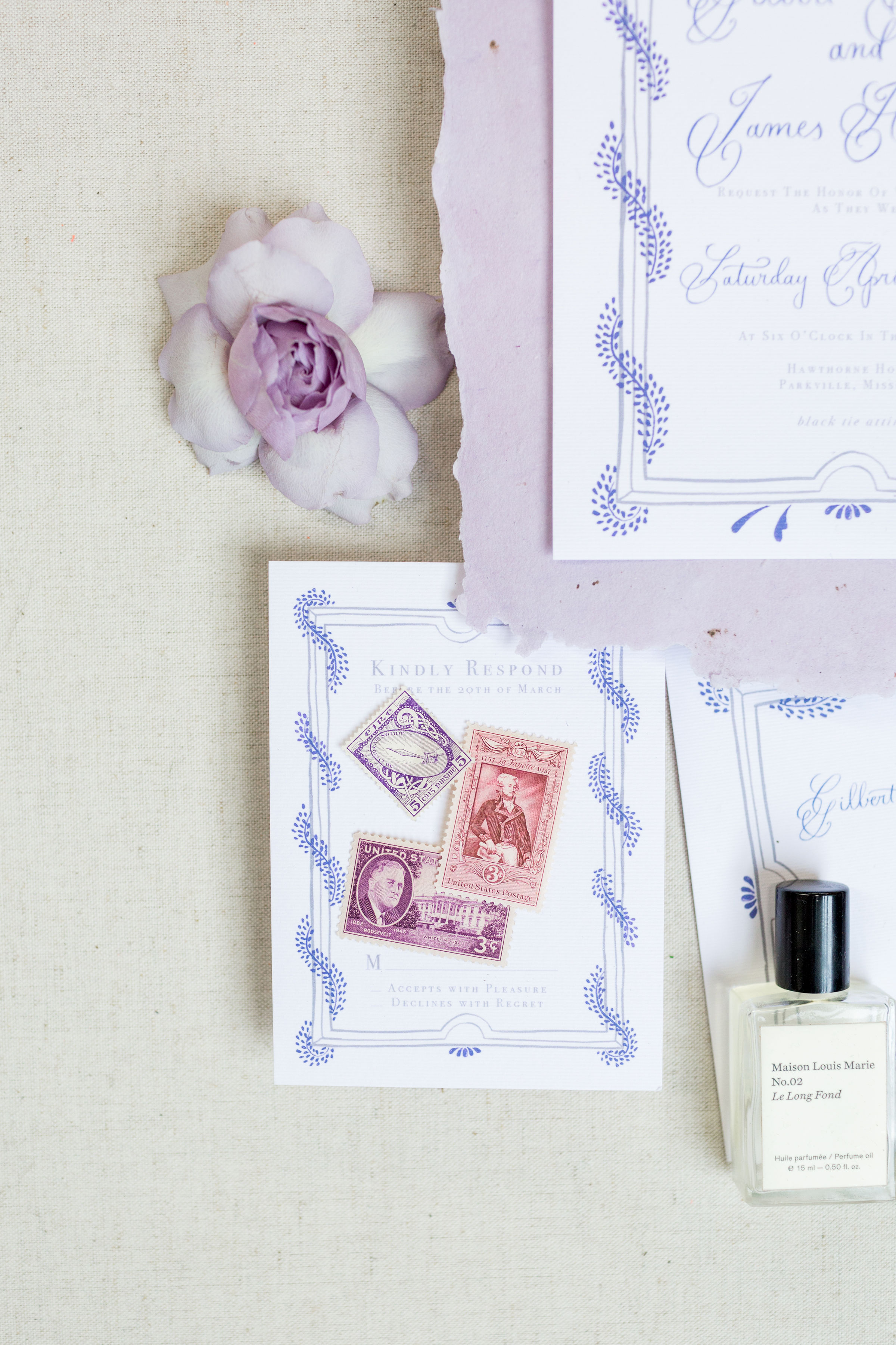
The theme for this color palette was “Stroke of Midnight,” and given the romantic tone for the shoot I immediately thought of Cinderella. A few years ago, I bought journal designed with the advertisements from Disney's 1950 Cinderella. The artwork beautiful was so beautiful and I've loved looking at it for inspiration. Given the romantic and vibrant color scheme from Pantone, I decided to use my inspiration from this 1950s artwork.
The style of leaves in the ad is particularly beautiful, and I loosely borrowed the shape of the of leaves to make a wreath around a frame for both the invitation, save the date, and response card. Each frame is slightly different, to give movement to the suite as a whole. And, of course, each piece features different colors from the palette.
I mixed boldly flourished capital letters and simple lowercase letters for a new calligraphy script that evokes vintage romance, yet is completely legible. My favorite mixture, surprise surprise, is to mix a simple all caps font with the calligraphy, so guests eyes
For this suite, I incorporated a piece of lavender handmade paper (made in Texas, by my mom, my partner in handmade paper making) gives a hint of old world romance, while the slightly textured felt paper of the invitation is clean and modern.

In order to keep the perfect balance of modern and classic, I incorporated vellum into the invitation suite and for the place cards. Using the gorgeously transparent paper gave an additional texture to this already vibrant feeling collection of paper goods. When handmade paper, felt paper, and vellum are combined, your guests are able to have a lovely sensory experience as they open your invitation. Pulling the vellum into your day-of goods is a way to ensure continuity from the guests’s first glimpse of your paper goods to your reception.
Curious about having unique paper goods of your own for your wedding? I’d love to work with you to create or work around a color palette and add lots of lovely texture. Fill out the inquiry form and I’ll be in touch with an initial quote & proposal within 24 hours!


Creative: @weddingwire
Floral Design: @therosyposy
Rentals + Venue: @smthingvintage
Baker: @fluffythoughtscakes
Styling: @sincerelypete
Photography: @kir2ben
Calligraphy & Stationery: @calligraphetteco