

When in Rome… do as the Romans do? And what do the Romans do? Beautiful fountains and buildings.
I’ve had this idea forever, to pull inspiration from the places I travel into invitation suites. When we planned a quick weekend to Rome for my husband’s birthday, this idea came back to me, and I decided that I should start with Rome. This is mostly just a creative exercise, focusing on paper, color, and printing, rather than focused on calligraphy, artwork, and form. My goal is to create these suites in under two hours. I start with inspiration images that turn into a color palette, then translate that onto paper in a digital mock-up. All done by hand by me, by the way, without the use of AI.
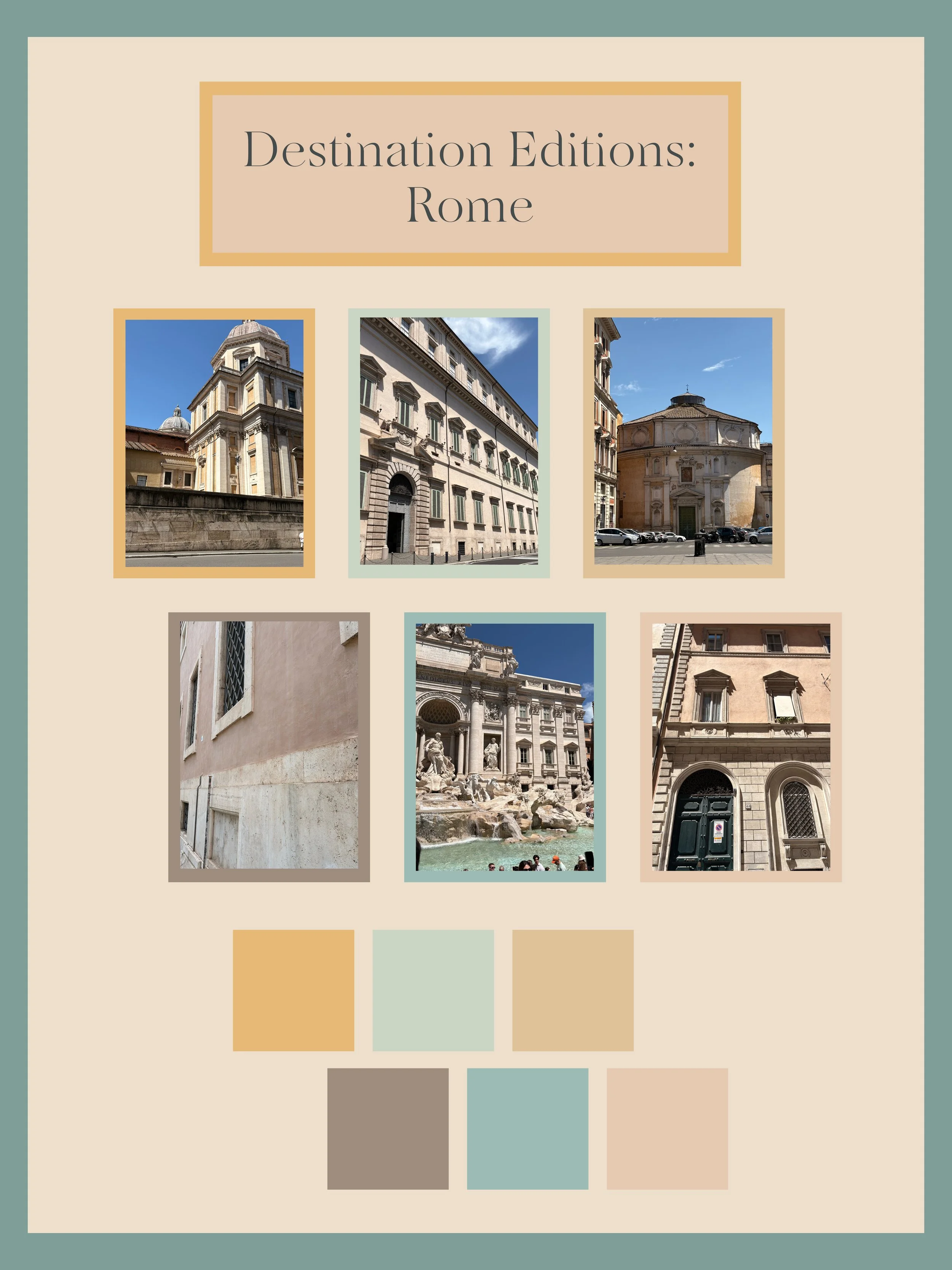
So, Rome! What’s the inspiration? We stayed somewhere between the Trevi Fountain and the Borghese, and I was so taken with the soft yellow and pinks on buildings. Of course the patinas of the walls are absolutely unbeatable. The window shutters on one building we passed several times a day really caught my eye. There was very little light and dark contrast between the soft blush of the building and the shutters other than the shadows, which I found mesmerizing. Then, of course, there’s the Trevi Fountain. Again, other than shadows, the colors were of very similar value, which I loved. It felt so bright and light, almost weightless.
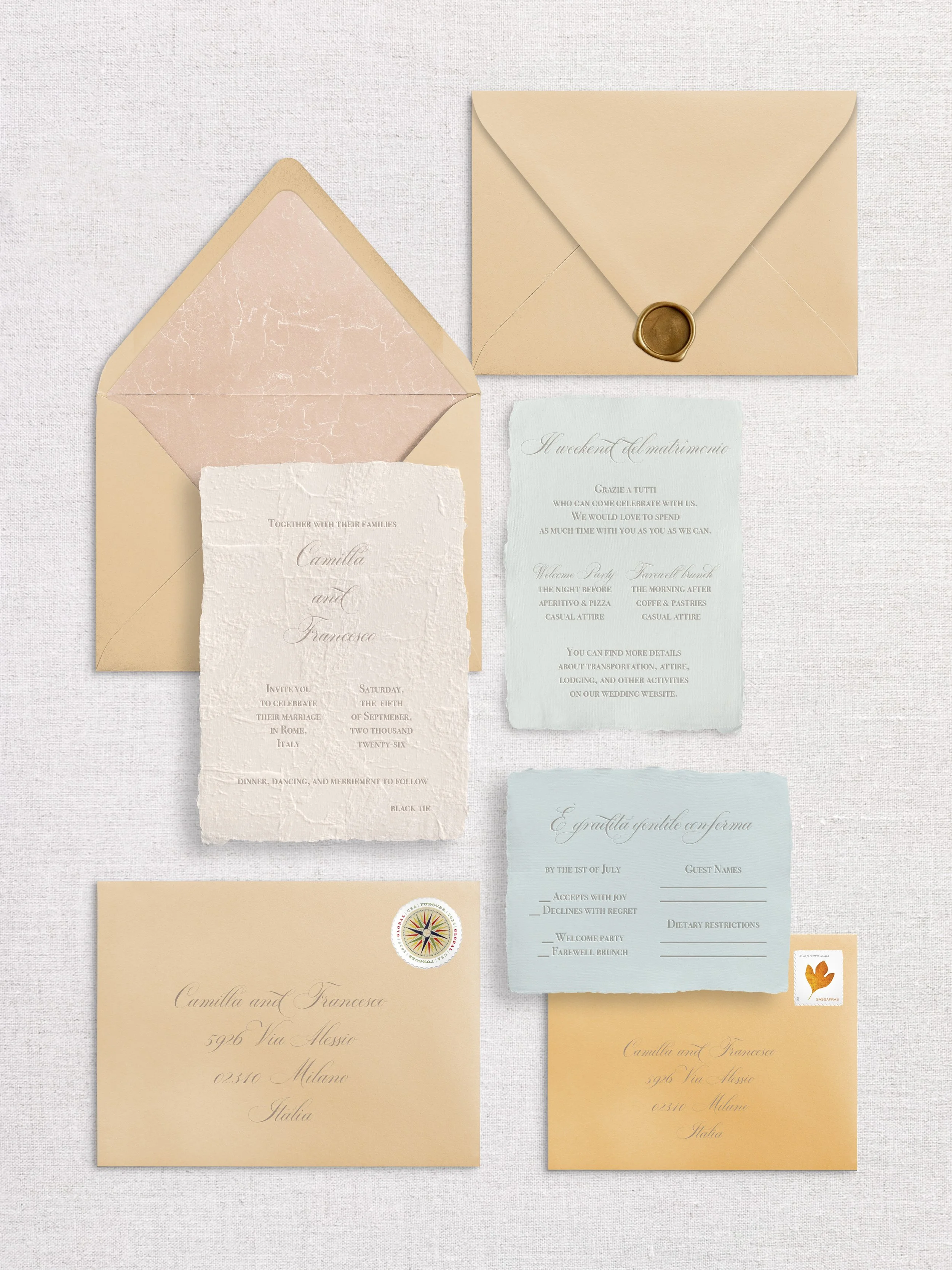
The star of the show has to be the invitation. It’s a delicate balance, to not make the detail card or envelope liner stand out more. Each insert is handmade paper, but on the invitation I added blind embossing with a stone effect, mimicking the patina of the walls. It also almost looks like an old letter, doesn’t it? Not mad about that. Then the detail and insert cards play to the softer cool colors, bringing in a subtle and unexpected contrast that I never would have created if it weren’t so location-specific. The invitation envelope is a gorgeously soft warm yellow, and the response envelope is a slight pop of color, with a bolder goldenrod. Of course, I had to bring in a desaturated warm mauve to the envelope liner, again playing with texture but this time a little more marbled looking.
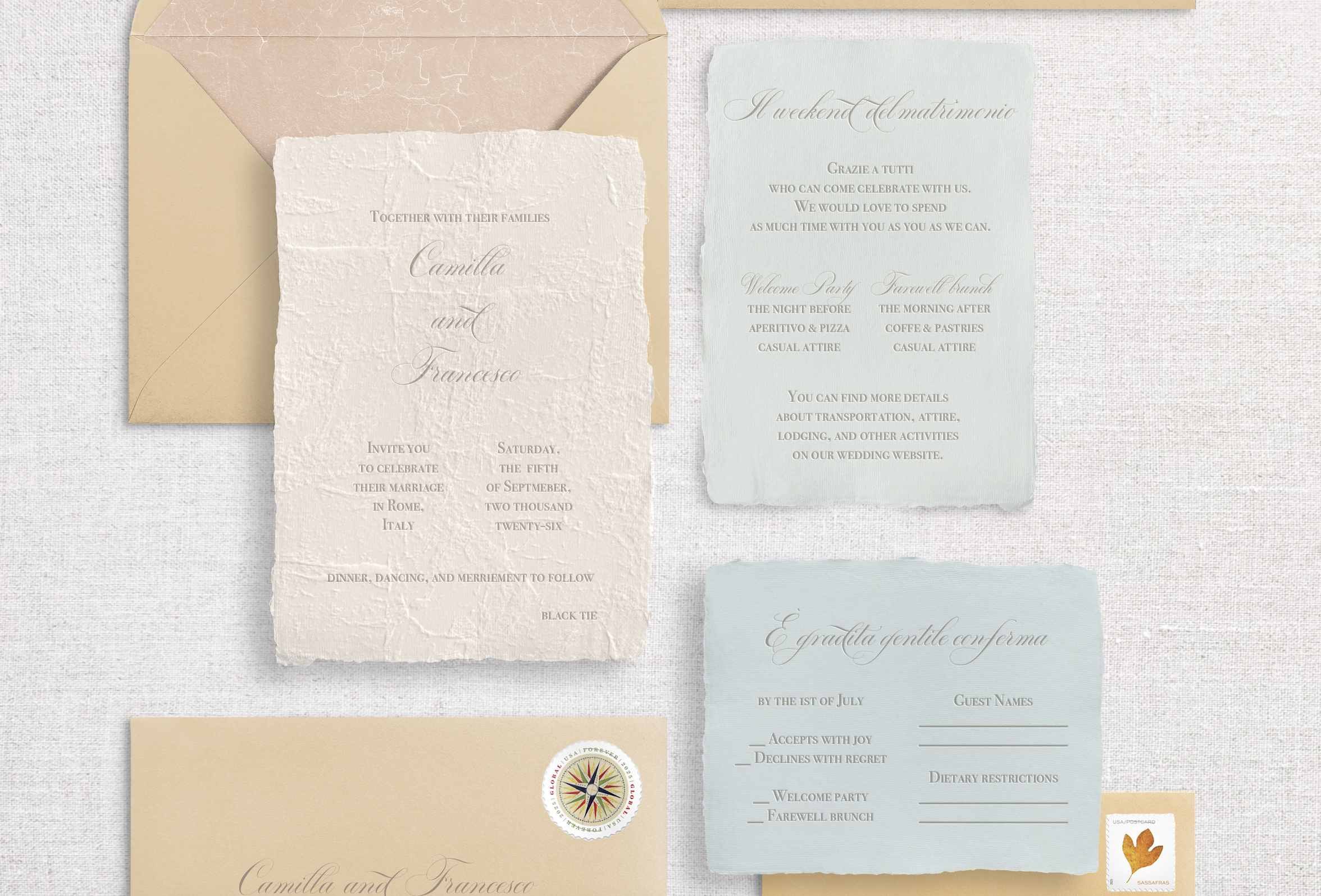
I paired a lightly flourished but very classic script font for the couple’s names and the headers with an absolute classic all caps font for the rest of the text. Last but not least, I put some of the text into columns, because if you don’t notice the columns in Rome then you’re not looking.
Nothing is better than creating a unique invitation suite from scratch. I see inspiration everywhere, and am always translating colors and textures into paper and ways to print. If you’re curious about what custom design looks like, peruse some fully designed suites through the above button, and always feel free to reach out to chat about your wedding, no strings attached.