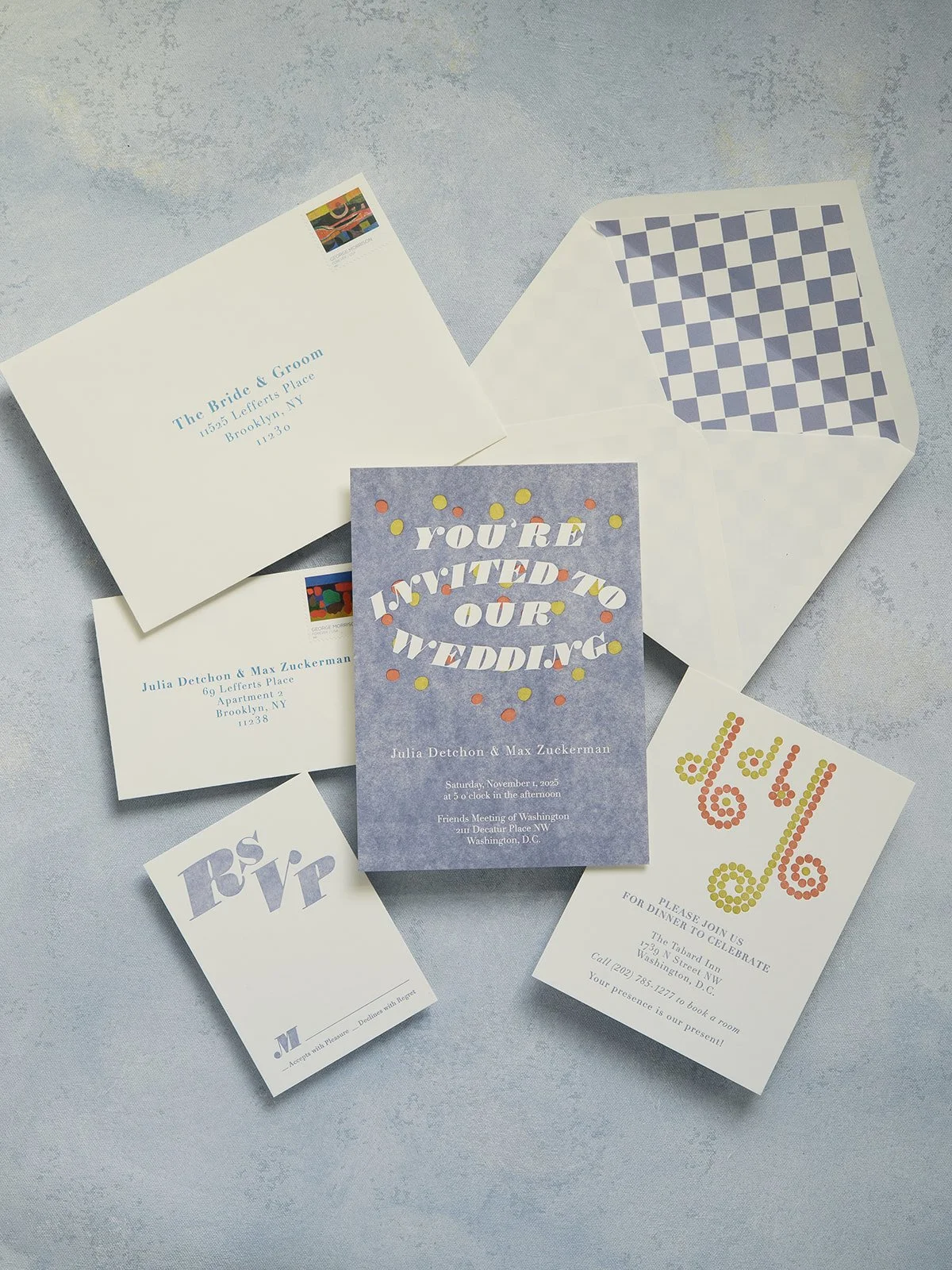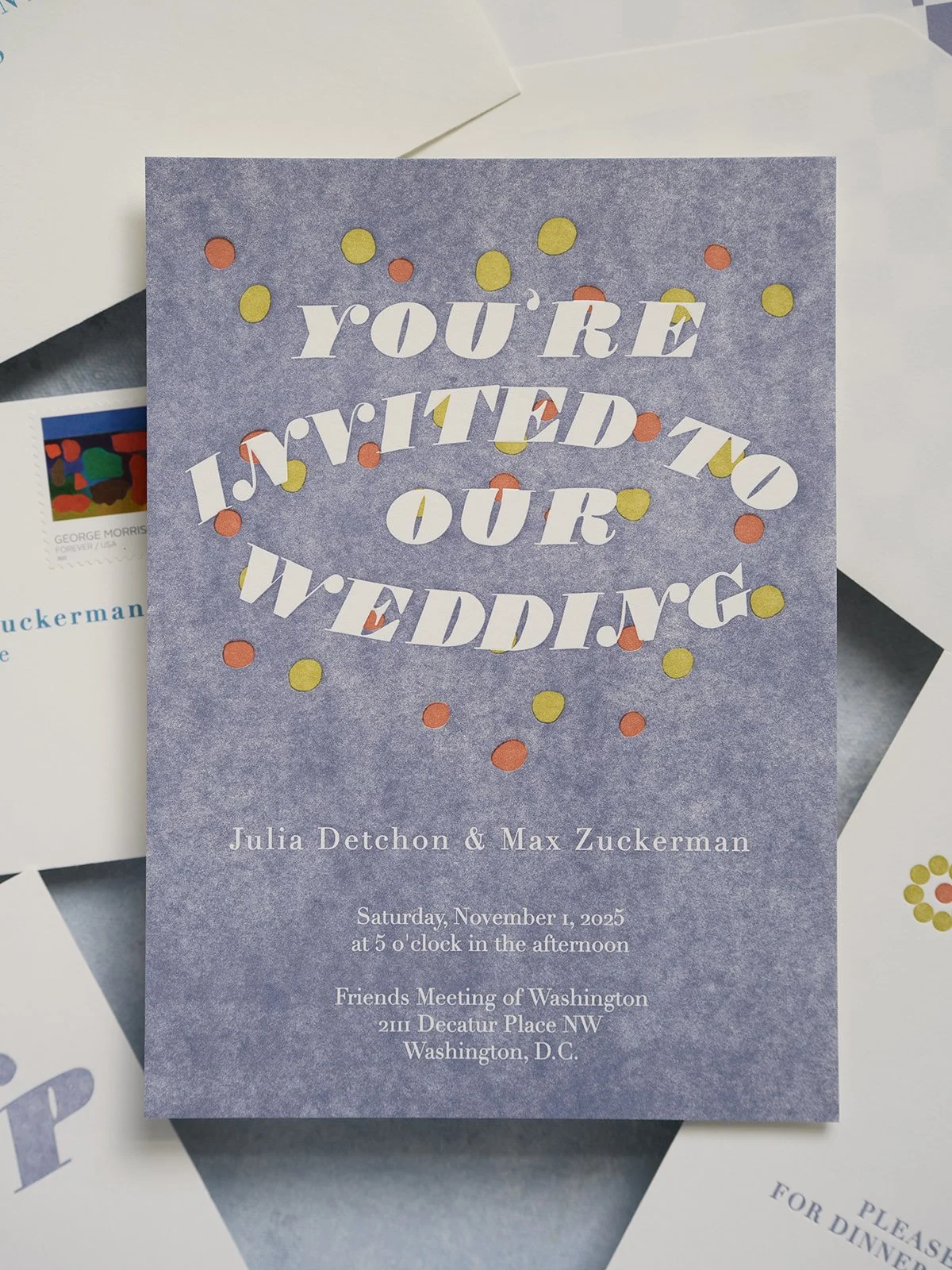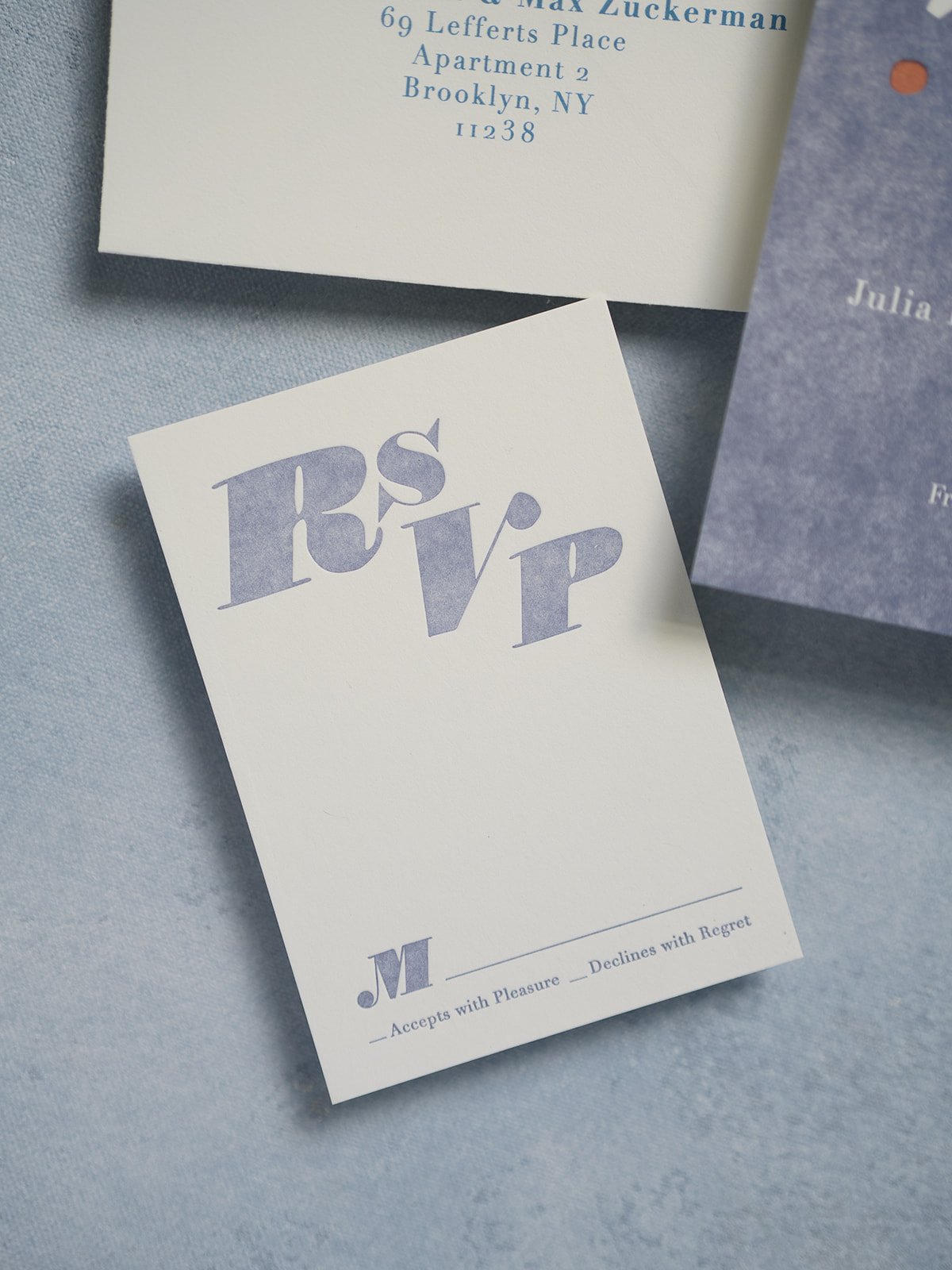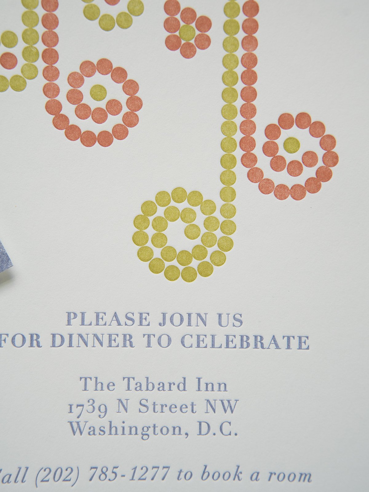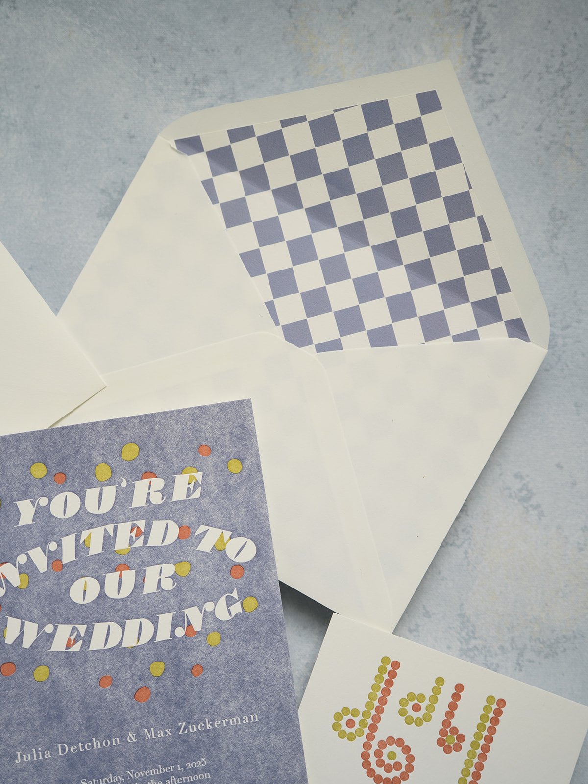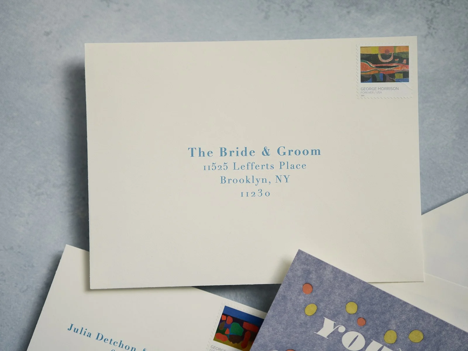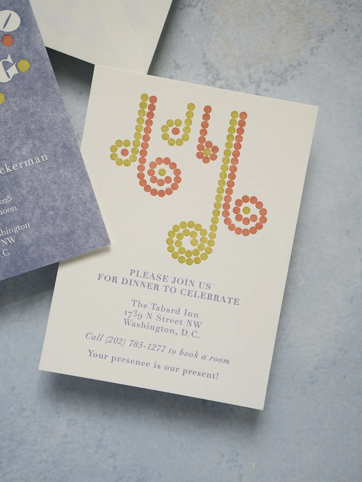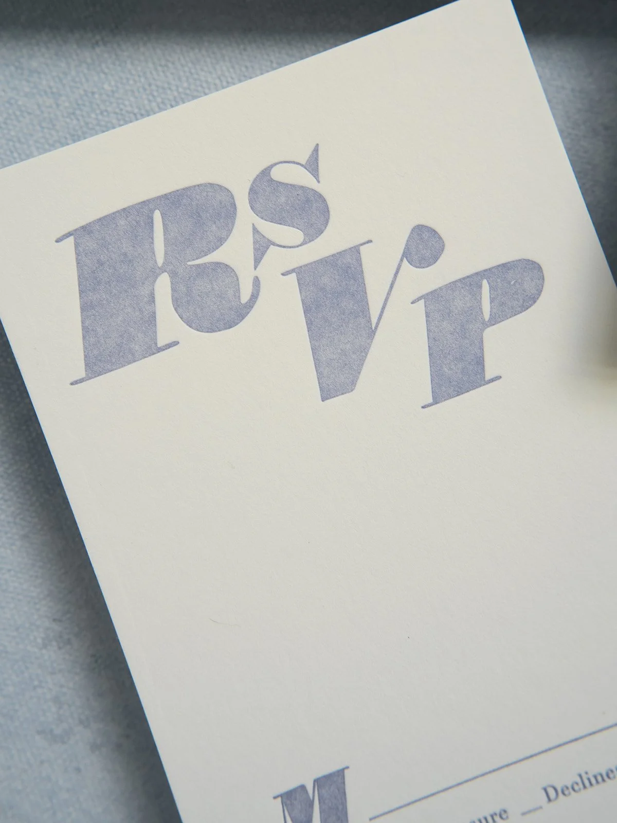

Some clients come to me with a vision, and then some clients come to me with a VISION. When the bride works at MoMa, you know the design inspiration is going to be top notch. Elaine Lustig Cohen was their source for color and design inspiration, and I re-created a font by hand to use for their invitation suite, inspired by a book cover. On the invitation, we used three colors of letterpress ink, with the white text as just the paper itself showing through. To provide a bit of contrast, the envelope liner featured a checkered blue and white pattern. The detail and response card pulled inspiration from other pieces by Lustig Cohen, but within the color palette of the invitation.
Some clients are particularly meticulous, which I think some designers could consider a hindrance to the process. I feel the exact opposite. Whether a client doesn’t know what they want and need a lot of guidance in looking through options, or knows so precisely what they want that we spend a lot of time tweaking small small things to make everything perfect… I’m 1000% here for it! I view my job as being vessel through which a client’s personality and vision can come through onto paper, whether they know that that is or not. A quick design process, or less attention to detail would result in something less than “that’s exactly what I envisioned,” and that’s not why you choose to work with a designer for your wedding invitations. I loved everything about working with Julia and Max, and everything about their suite.
“Just wanted to say THANK YOU one last time for all the amazing work you did for us. Both sets of invitations, cute fonts and envelopes and liners, the welcome poster, menus, table numbers, matchbooks...they all looked so great. I know when we originally reached out we had designs in mind that were a little outside your usual wheelhouse, but you totally understood our vision. Hopefully we didn't drive you crazy in the process. We are eternally grateful!!”