
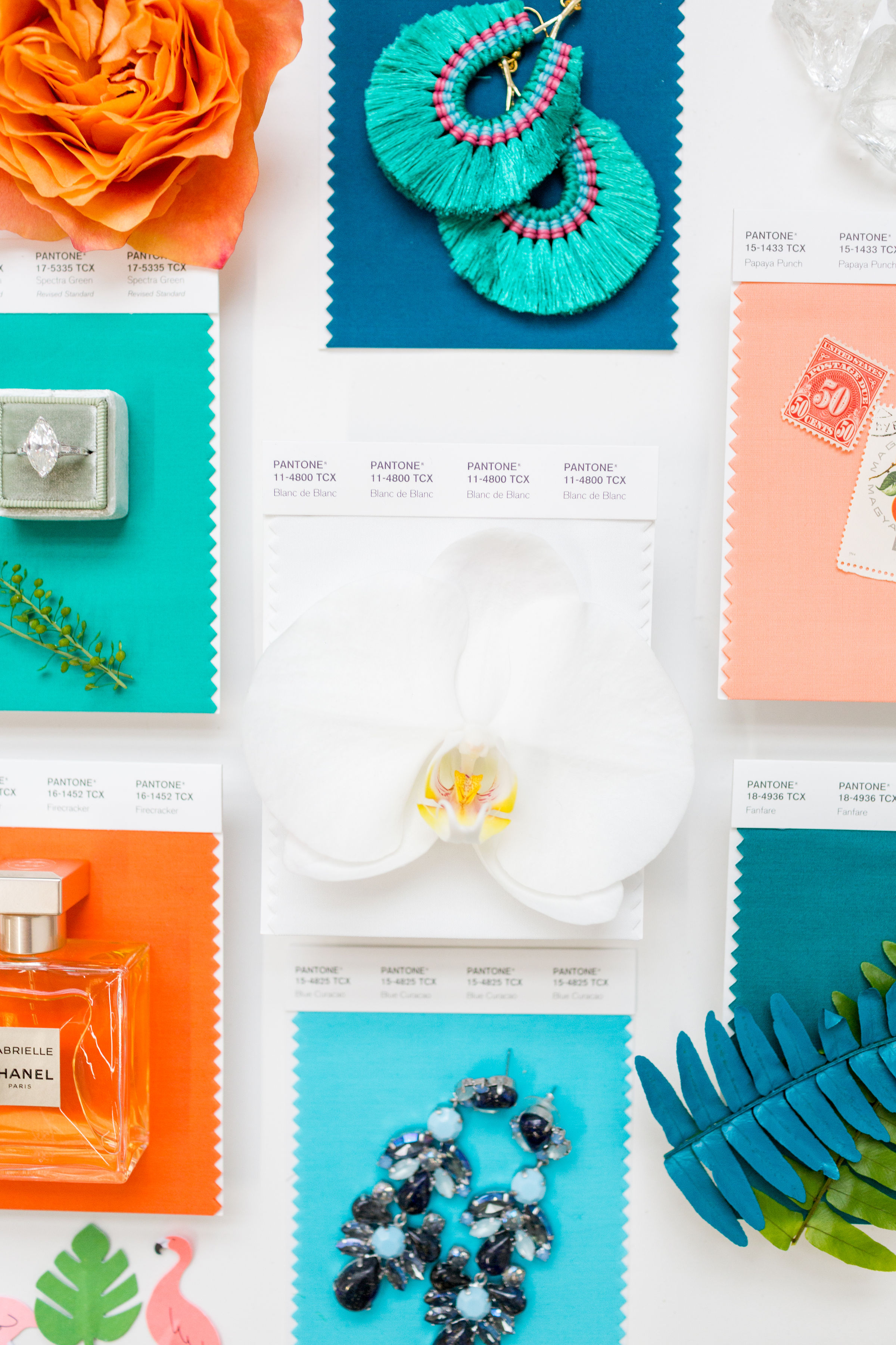
Choosing your wedding colors can be daunting, so Pantone & Wedding Wire worked together to create four color stories for 2019 weddings to inspire couples with these distinct palettes. I loved working with them to create the paper goods for two of the shoots.
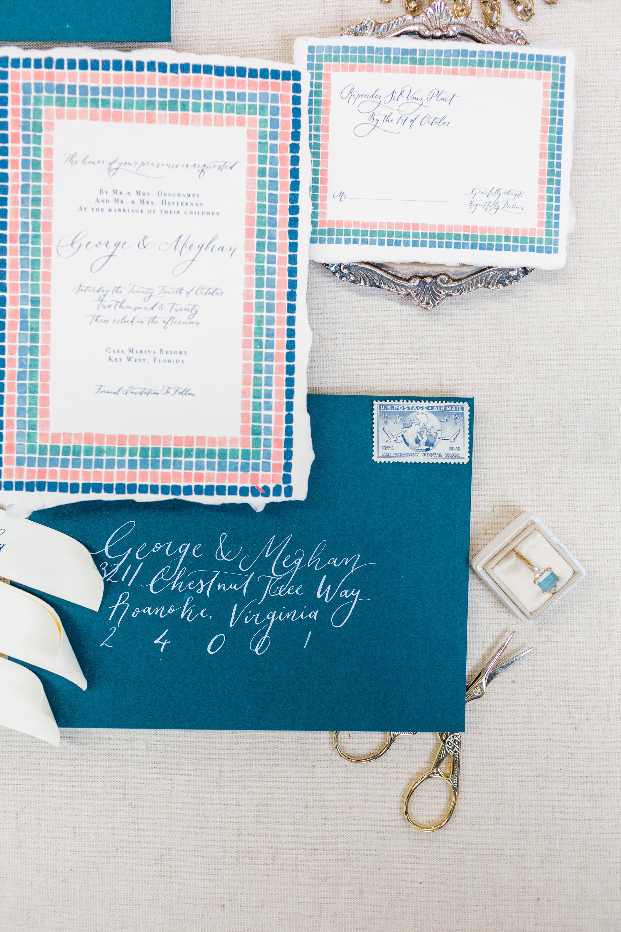
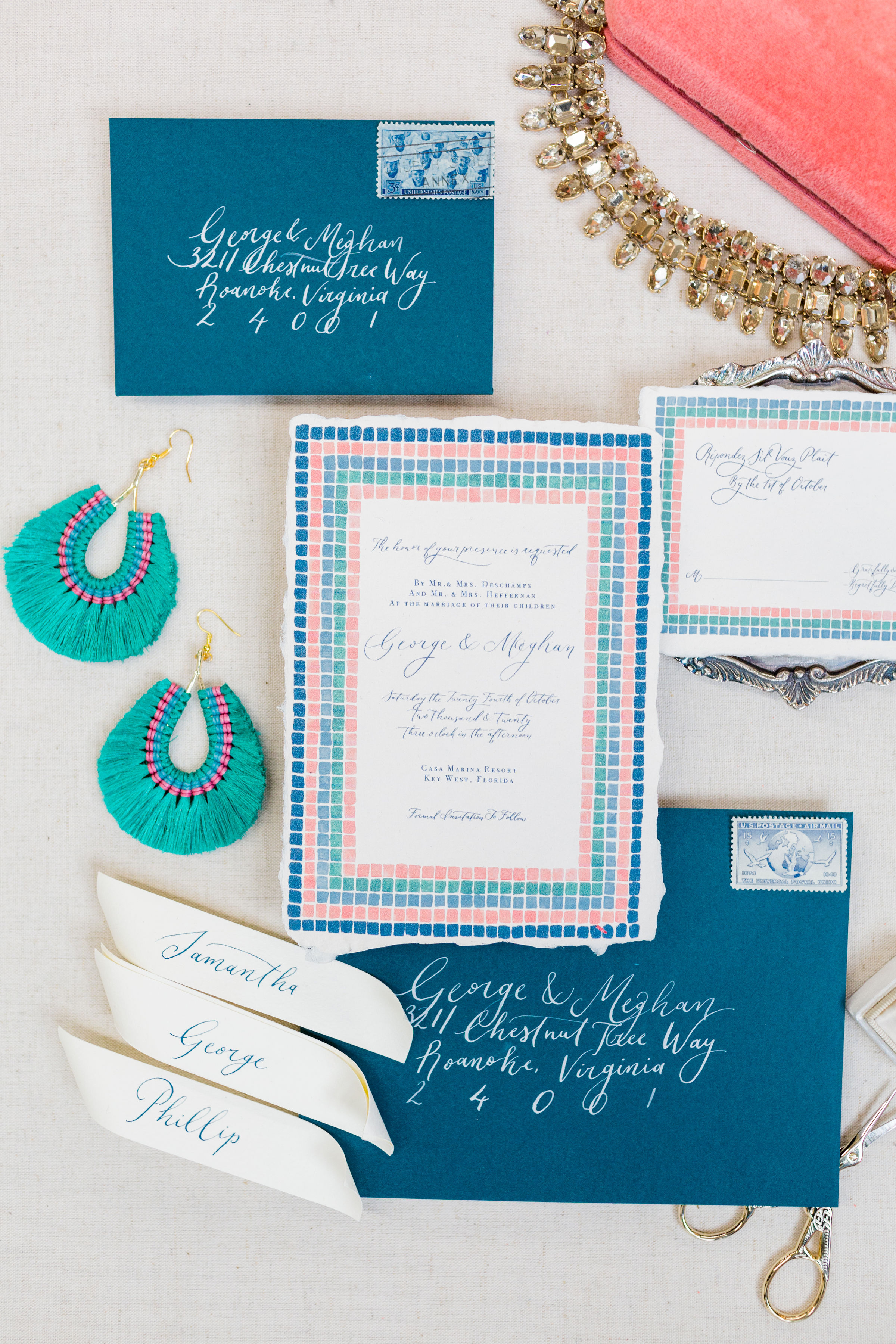
The theme for this color palette was “Paradise Found.” On a recent trip to New York, I couldn’t stop staring at the beautiful tile mosaics of the station names on the subway. Given the gorgeous tropical color scheme, I decided to give a nod to the stops on the NYC subway.
After some measurements and math, I created a grid pattern, mixed my gouache paints into the very specific colorsPantone gave me, and hand-painted each tile. Then, I scanned this into my computer and voilà!
I mixed a romantic, Jane Austen inspired, calligraphy script with a bold all caps font for the body of the invitation. Contrasting modern and traditional is one of my favorite ways to create movement within an invitation so that it breathes and feels alive, rather than just a piece of paper.
As always, handmade paper is a touch I love to incorporate. Share Studios cream paper is shown here, printed in my calligraphy studio. Again, the modern and playful feel of the bright tile pattern mixes perfectly with the old world feel of the natural deckle edge of the paper.

Place cards are such a fun detail that really help pull together your wedding reception. These miniature scrolls are simple enough to not be distracting, but incorporate the color palette with hand mixed teal ink.


Creative: @weddingwire
Floral Design: @therosyposy
Rentals + Venue: @smthingvintage
Bar set up: @bedbathandbeyond
Styling: @sincerelypete
Photography: @kir2ben
Calligraphy & Stationery: @calligraphetteco